Past - 'All From One'
Brand Identity Design
_______
Brand Identity Design
_______
The Logo
The Palaeontological Scientific Trust is a public-benefit organisation, dedicated to protecting, preserving and promoting the scientific evidence of our shared origins in Africa. PAST uses these origin sciences as a tool for promoting racial harmony and environmental conservation. The bold typographical logo takes inspiration from PAST’s previous identity - the march of progress.
The Palaeontological Scientific Trust is a public-benefit organisation, dedicated to protecting, preserving and promoting the scientific evidence of our shared origins in Africa. PAST uses these origin sciences as a tool for promoting racial harmony and environmental conservation. The bold typographical logo takes inspiration from PAST’s previous identity - the march of progress.
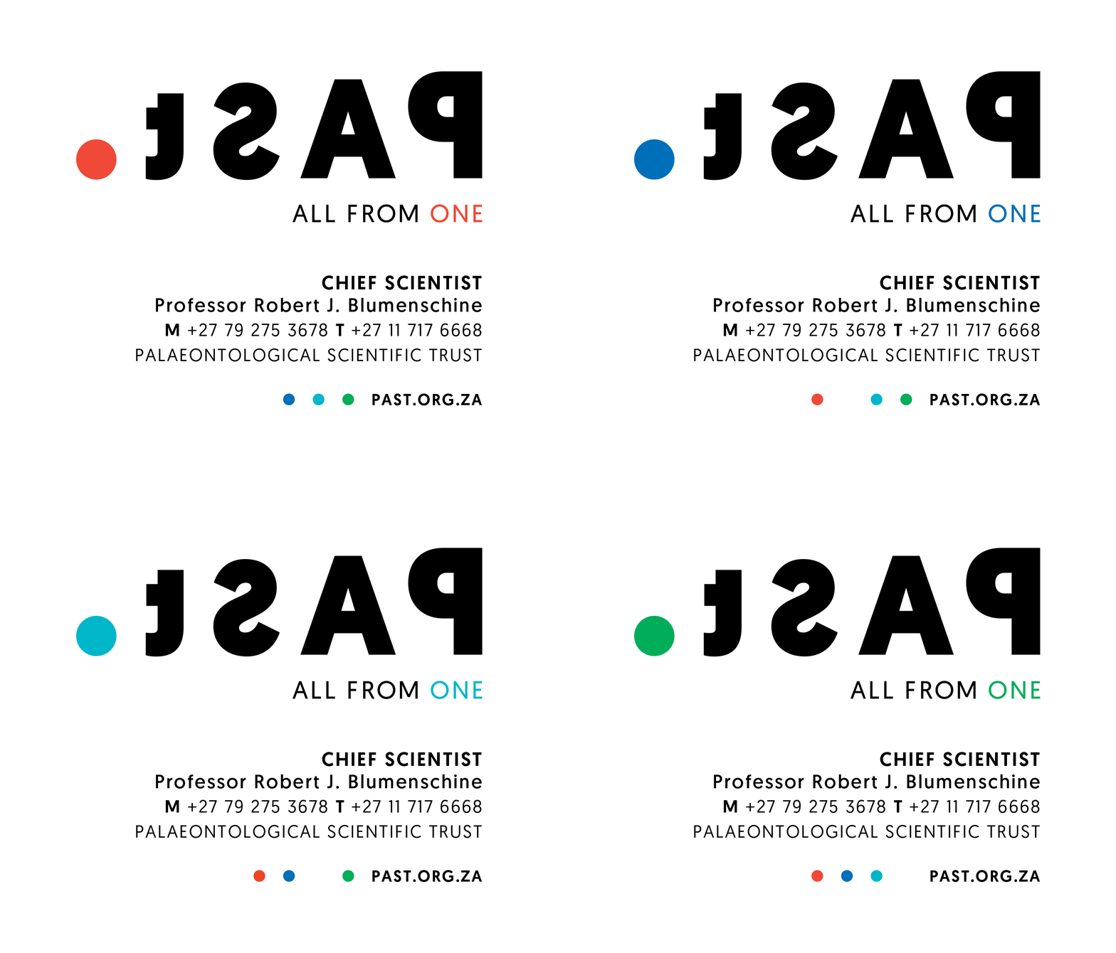
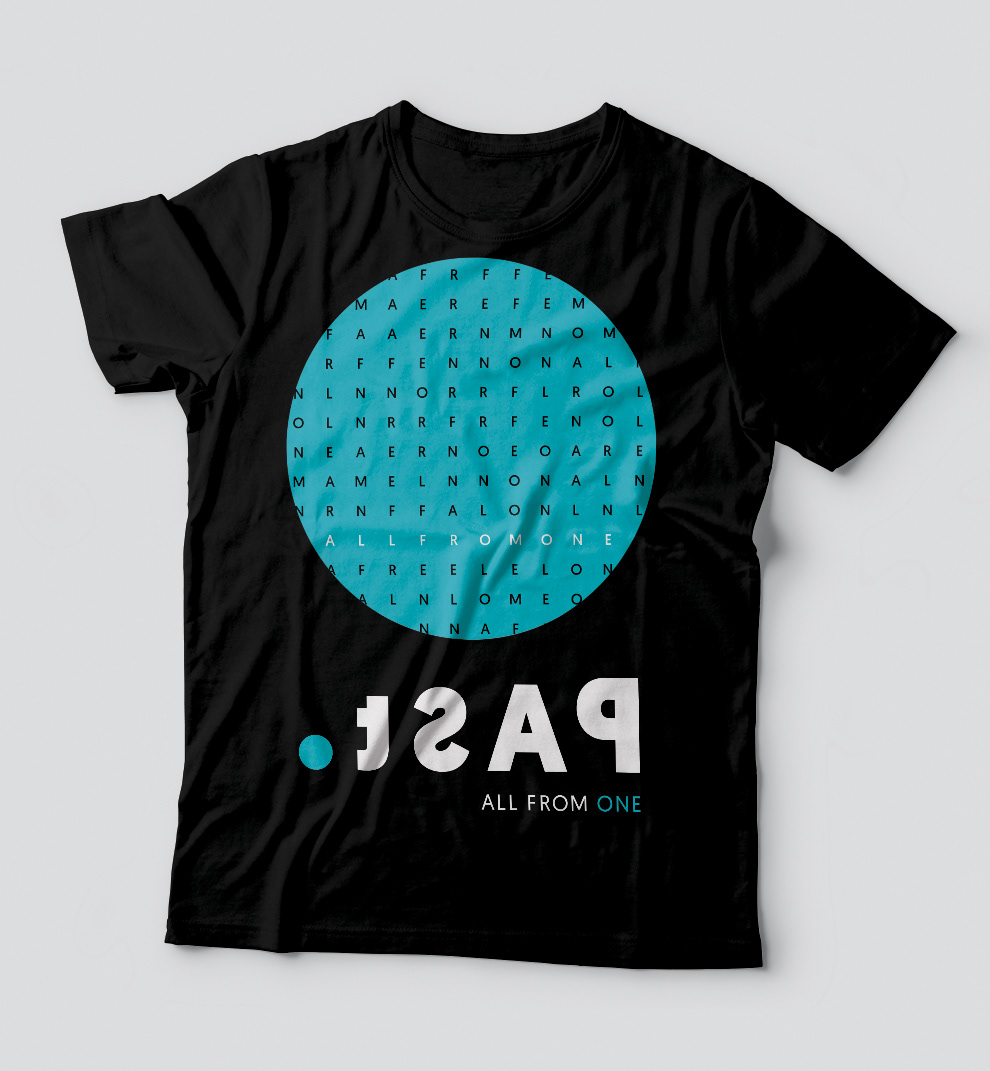
By reversing the letters P, A, S and t all facing towards a definitive point of origin, a link is made between the logo and the core focus of PAST; looking back at our history and sparking an immediate link to archaeology and paleontology.
Awards:
One Show - Merit
Loerie - Bronze
One Show - Merit
Loerie - Bronze
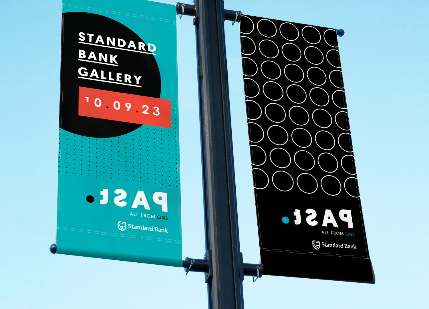
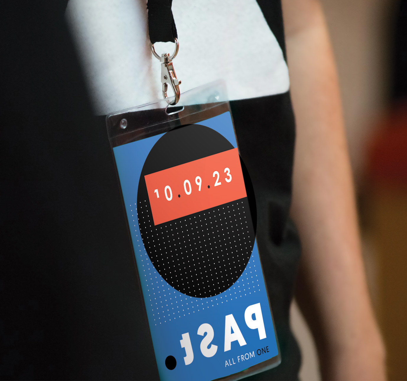
Logo Variations & Colour
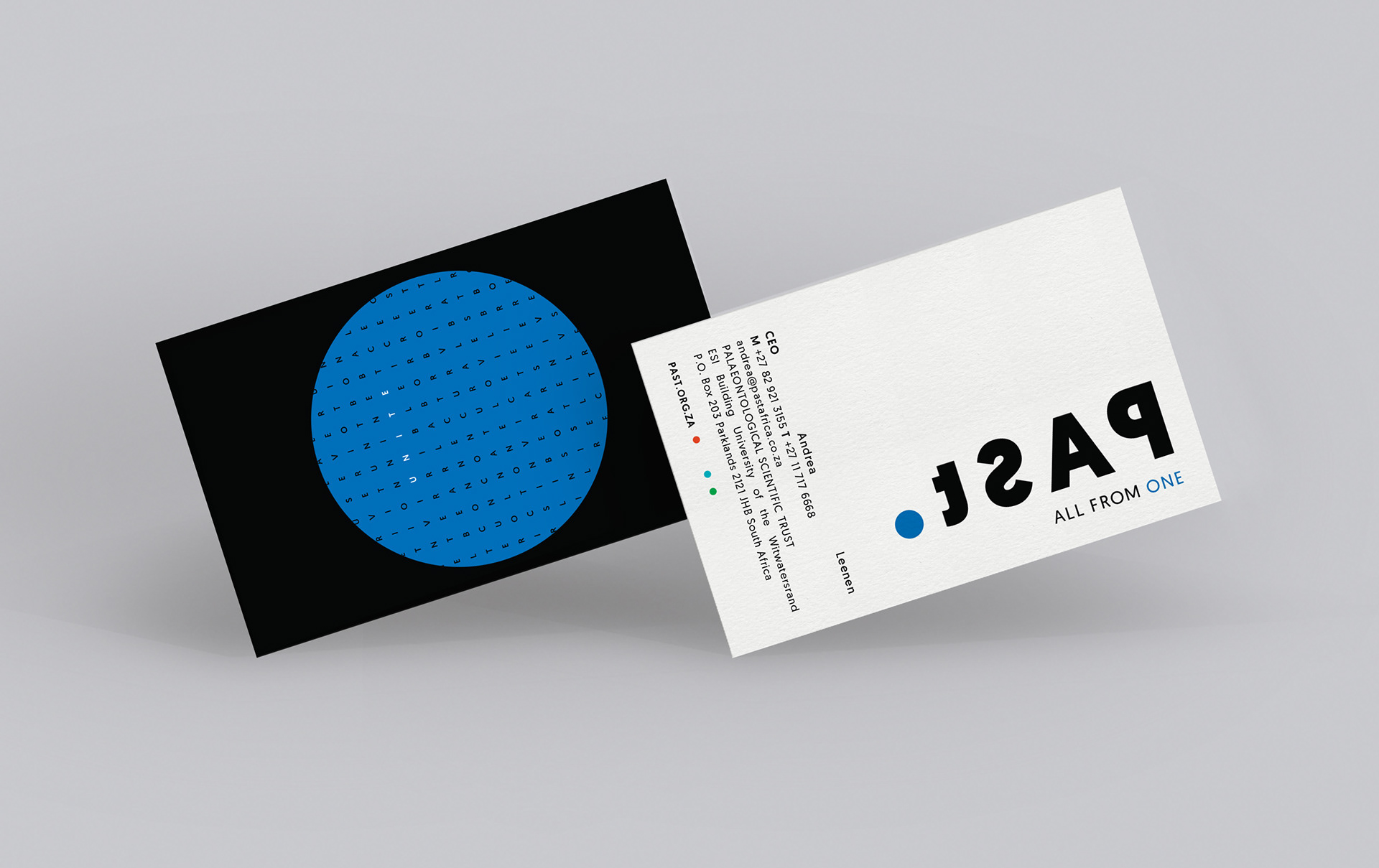
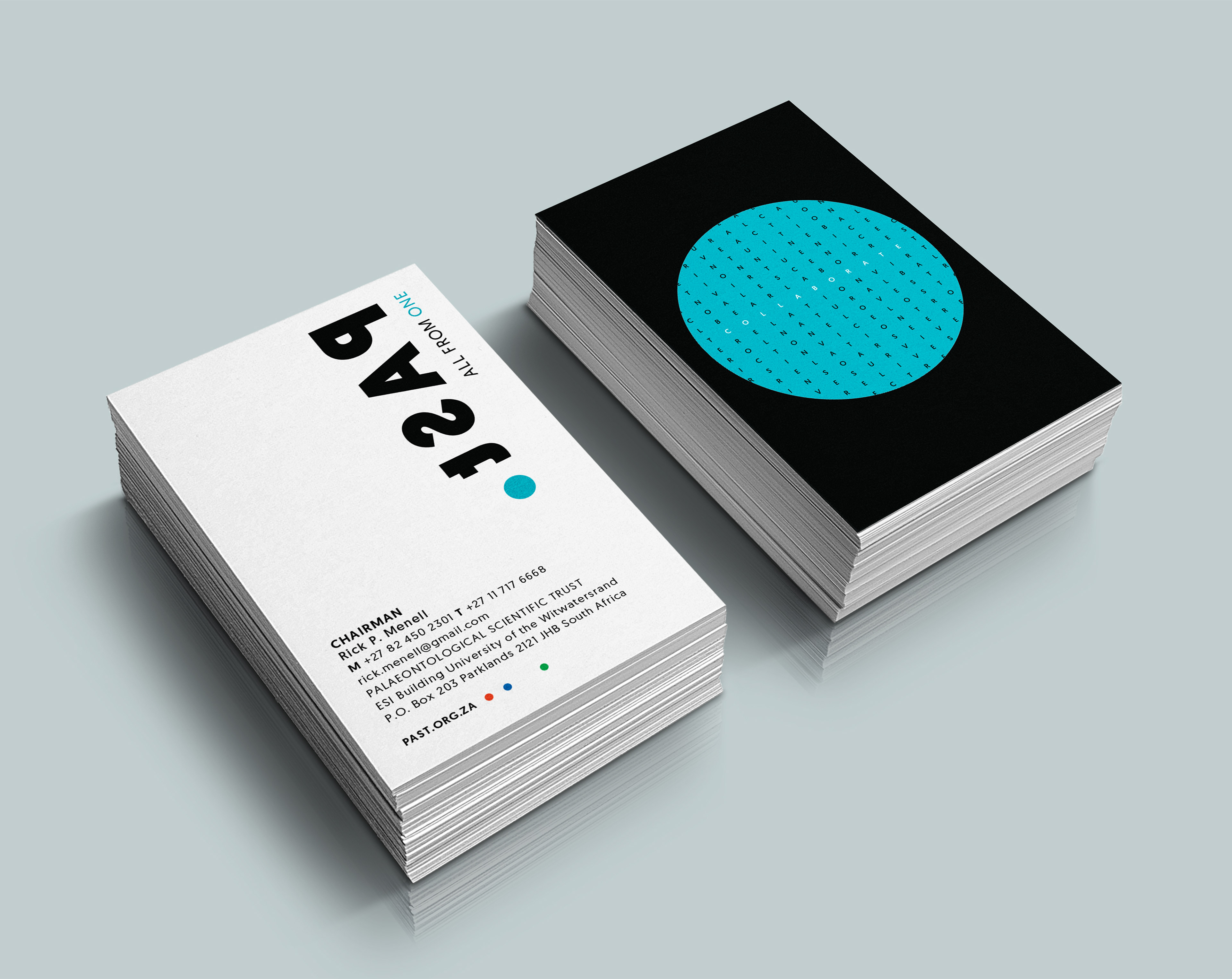
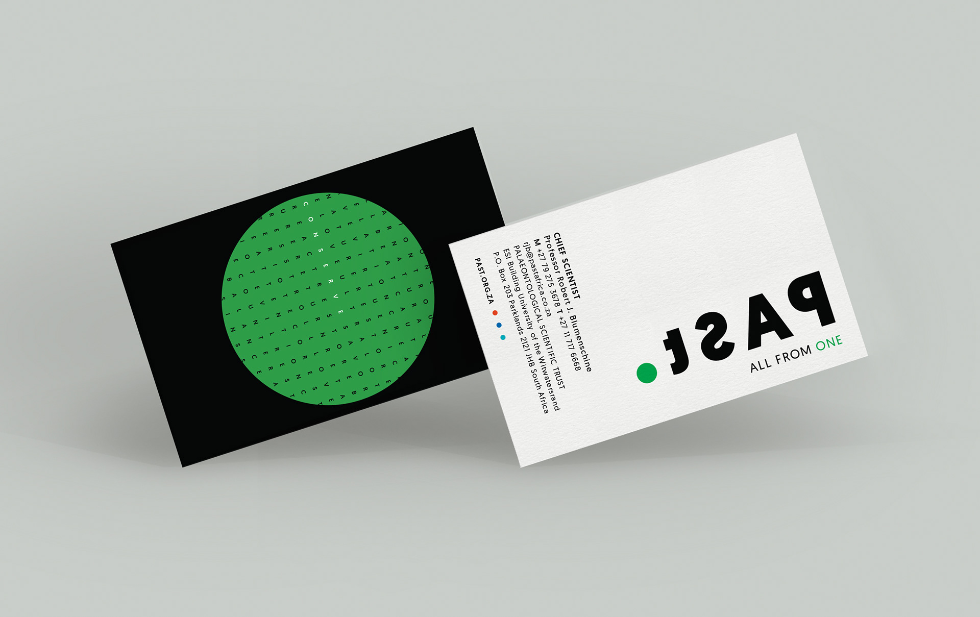
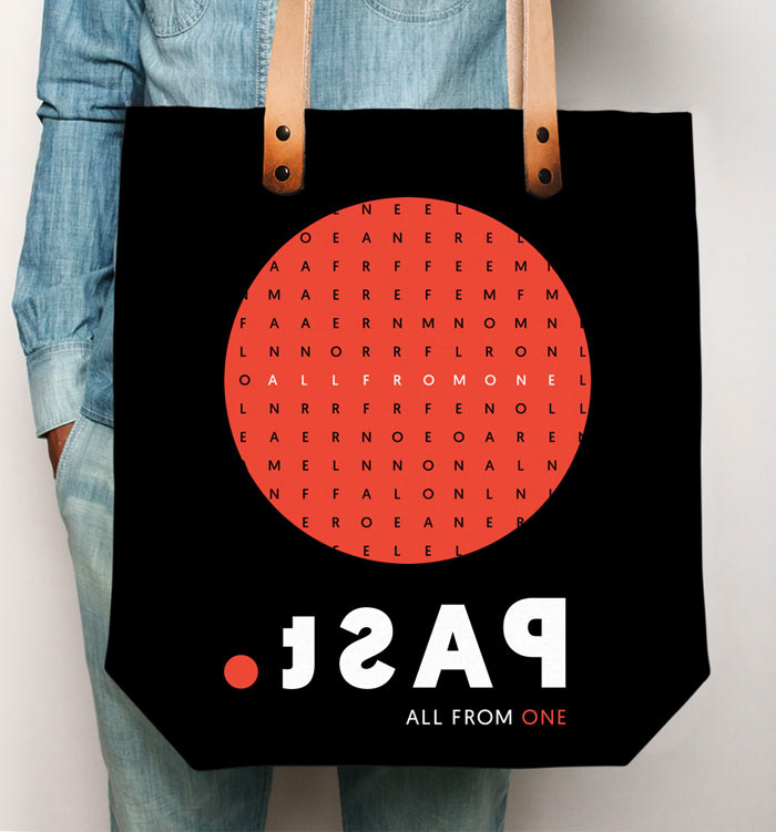
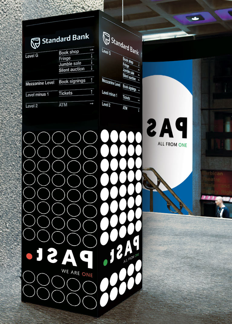
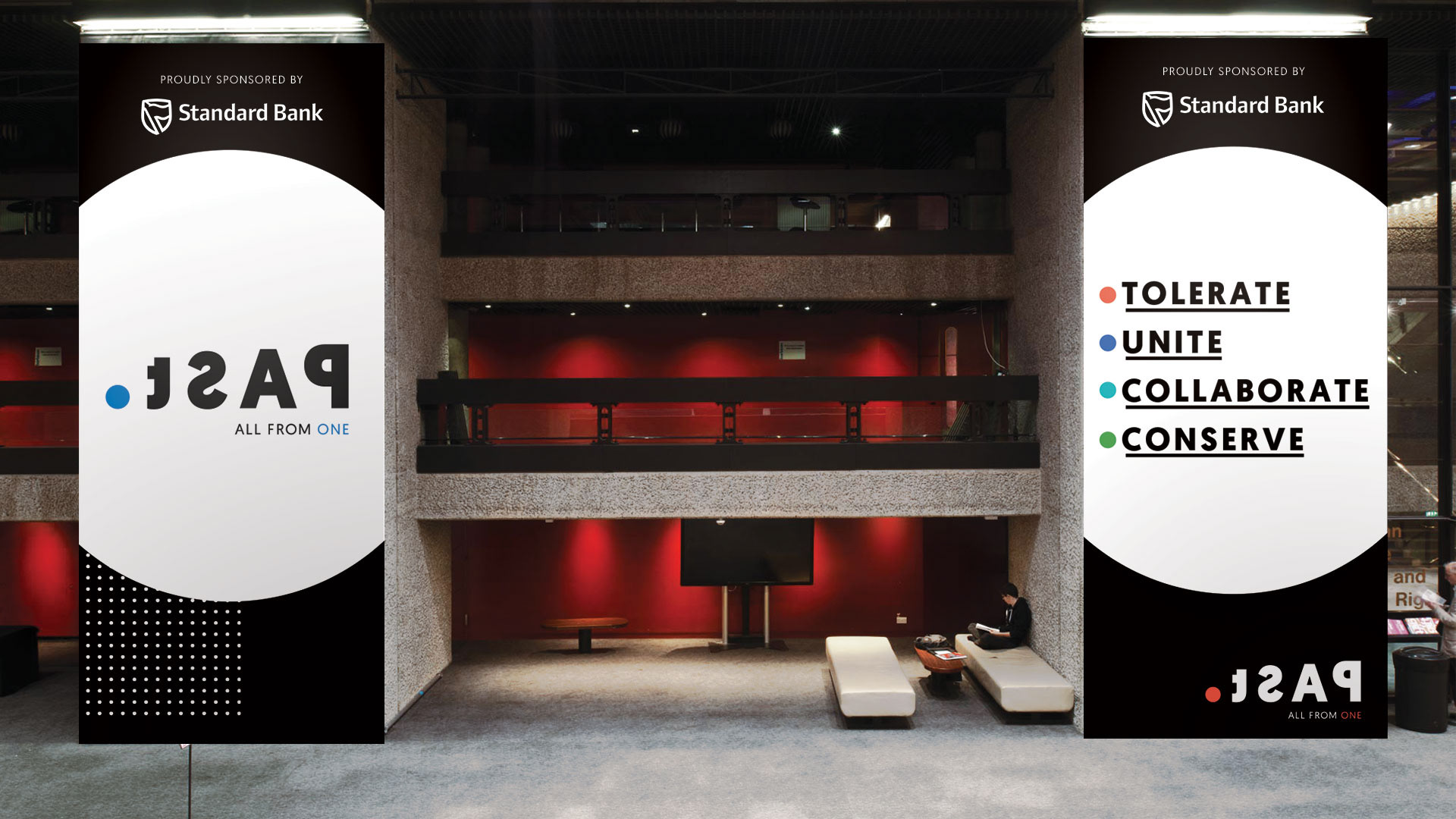
The dot in the logo signifies a point of origin and our common ancestry. We are ALL FROM ONE.
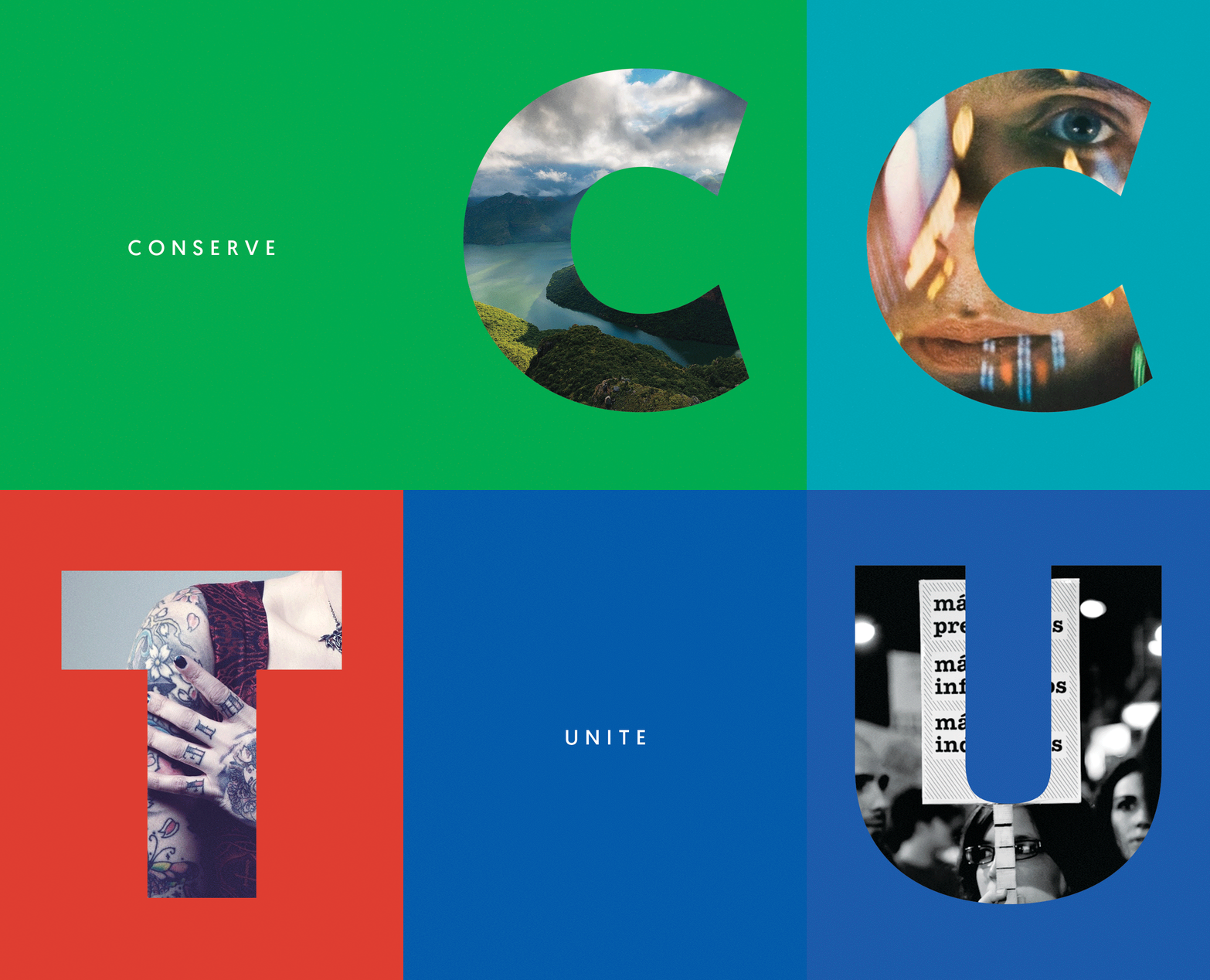
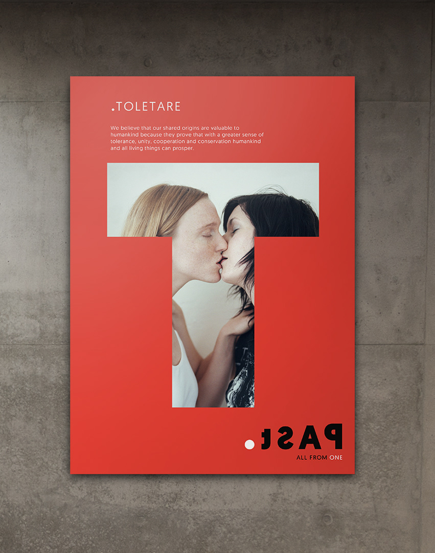
It is used in brand communications and represents the four brand pillars; Tolerate, Unite, Collaborate and Conserve, each owning their own unique colour.
The Dot
The dot plays an integral role in the logo construction and general brand communication. It represents a molecule, the basic makeup of our DNA. It symbolises one individual, one kind, one past and that we are
all from Africa: ALL FROM ONE.
DNA Sequence
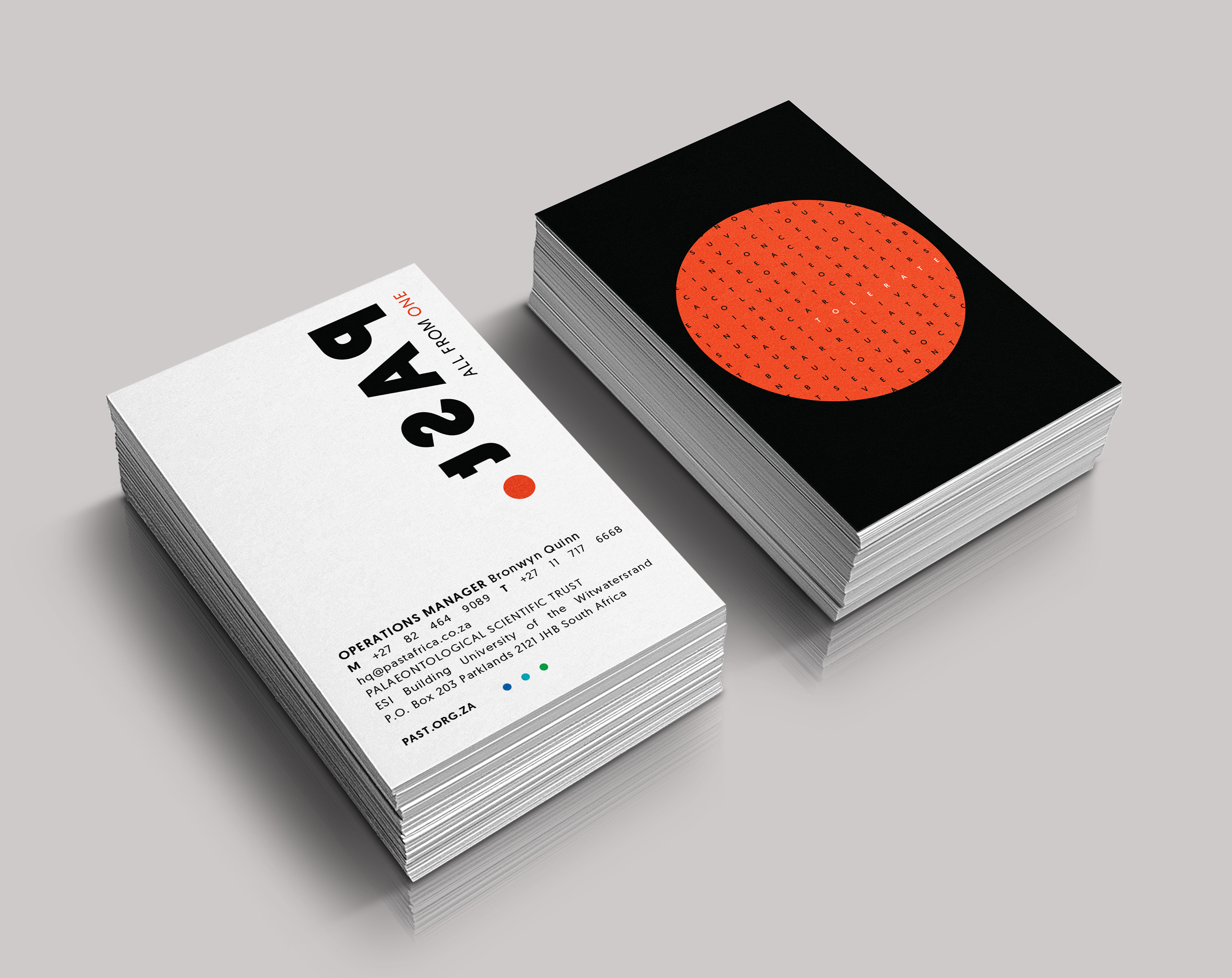
The design uses a visual representation of DNA sequencing to highlight the 0.1% difference in human genes.
A ‘DNA sequence' graphic element was developed with random letters arranged in a circular pattern, resembling DNA seen through a microscope. The tagline 'ALL FROM ONE' and the words from the four brand pillar emerges, showing that despite minor genetic differences, core human values connect us all.


***
Credits:
Concept, Design & Art Direction:
Jo Theron & Shannon Davis
Grid Worldwide
Credits:
Concept, Design & Art Direction:
Jo Theron & Shannon Davis
Grid Worldwide
